What is the Best Color to Display Jewelry?

When displaying jewelry, choosing the right colors can dramatically change the customer’s perception of the jewelry. The color of the display background can enhance the beauty of the jewelry, highlight specific features, and create an overall atmosphere that complements the brand and target audience. In this article, we will explore the various factors to consider when choosing the best colors to display jewelry and provide practical tips for effective presentation.
Displaying jewelry is an art that requires careful consideration of many elements. While factors such as lighting, staging and props play a vital role, the choice of color for the display background is equally important. Different colors evoke different emotions and associations, and they can enhance or detract from the beauty of the jewelry.
The importance of color in jewelry display
Color has a profound effect on the human psyche, influencing the way we perceive objects. In the case of jewelry, color can create emotional connections, evoke desire and communicate brand identity. The right color can draw attention to jewelry and make it stand out, thus increasing the chances of attracting potential customers.
Factors to consider when choosing color
Several factors should be considered when deciding on the color of your display jewelry. These include metal color, gemstone color, jewelry style and design, as well as target audience and brand image.
Metallic colors
When choosing a display color, the color of the metal used in the jewelry should be considered. For example, white gold or platinum jewelry often looks sophisticated against a black or dark blue background because it creates a high contrast that highlights the brilliance of diamonds or colored gemstones.
Gemstone Colors
Gemstones come in a variety of colors, and the background color should coordinate with the dominant gemstone hue. For example, brightly colored stones such as rubies, emeralds or sapphires may stand out against a neutral-colored background, allowing their natural beauty to shine through.
Jewelry Style and Design
The style and design of the jewelry should also guide the choice of color. Traditional and vintage pieces often pair well with softer, more muted background colors such as pastels or earth tones, creating a sense of nostalgia. On the other hand, contemporary and modern designs may benefit from bold and contrasting colors to convey a sense of energy and excitement.
Target Audience and Brand Identity
Understanding the target audience and brand identity is critical to determining the appropriate colors for jewelry displays. Consider demographic preferences and brand identity. For example, if the target audience is young and trendy, then bright, eye-catching colors may be more appealing. On the other hand, a luxury brand that caters to a sophisticated clientele may choose more elegant and understated colors.
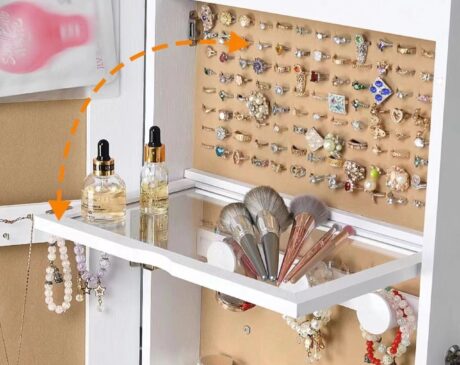
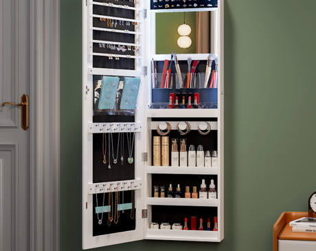
Enhance the colors of different types of jewelry
Different types of jewelry can be enhanced with specific colors to enhance their character and create a captivating display.
Diamond and white gold
Diamonds, known for their brilliance, sparkle and clarity, are usually best displayed against a dark background. A black or dark blue background creates a stark contrast that enhances the diamond’s brilliance and makes it appealing to the viewer.
Colored stones
Colored gemstones come in a variety of shades, and the color of the display should be chosen to harmonize with the color of the gemstone in order to complement its natural beauty. For example, green stones such as emeralds can be highlighted against a complementary red or purple background, creating an attractive contrast.
Pearls and soft tones
Known for their luster and delicate appearance, pearls often complement soft colored backgrounds. Pastel shades of pink, mauve or light blue create a soft and elegant setting that enhances the beauty of pearls.
Antique and vintage jewelry
Antique and vintage jewelry often evoke a sense of history and nostalgia. Setting them against warm, rustic tones such as dark brown or burgundy enhances their vintage appeal and creates a cohesive aesthetic.
Contemporary and modern designs
Contemporary and modern jewelry designs offer greater flexibility in terms of color choices. These pieces often use bold and vibrant colors to convey a sense of innovation and creativity. Experimenting with contrasting colors, such as pairing bright yellow with dark blue, can create a striking effect.
The impact of lighting on jewelry displays
While the choice of display color is important, it is also important to consider lighting conditions. Lighting can significantly affect the image of jewelry in front of customers. Natural daylight-like lighting is ideal for displaying the true colors of jewelry, allowing customers to appreciate the brilliance of gemstones and the luster of metals. It is important to avoid harsh or overly warm lighting, which can distort the colors and alter the overall look of the jewelry.
Effective Jewelry Color Presentation Techniques
To create an engaging and visually appealing jewelry display, consider the following tips:
Color Combinations and Contrasts
Experiment with color combinations and contrasts to create visual interest. Complementary colors, such as red and green or blue and orange, can create a harmonious balance, while contrasting colors, such as black and white or yellow and purple, can make jewelry stand out.
Coordinate with brand elements
Align display colors with the visual identity of the brand. Incorporating brand colors or elements into the display creates a cohesive and recognizable aesthetic that reinforces the brand image.
Test and Experiment
Don’t be afraid to experiment with different colors and arrangements. Set up sample displays using a variety of color combinations and lighting conditions to evaluate their impact on the appearance of the jewelry. A little experimentation can lead to more appealing and effective displays.
Case Study: Successful Color Displays in Jewelry Stores
Observing successful jewelry stores can provide inspiration for color display strategies. Let’s explore a few examples:
Tiffany & Co.
Known for its iconic blue brand, Tiffany & Co. incorporates its signature color into its jewelry displays. The blue backdrop creates a luxurious and elegant atmosphere that complements their diamond and gemstone jewelry collections. The color not only fits their brand image, but also enhances the beauty of the jewelry, making it immediately recognizable and memorable.
Cartier
The famous luxury jewelry brand Cartier often opts for a classic and sophisticated display. Their displays are often in neutral colors such as cream, beige or light gray, allowing the vibrant colors of gemstone jewelry to be the focal point. The understated background creates a sense of timeless elegance, allowing customers to appreciate the exquisite craftsmanship of these pieces.
Pandora
Known for its glamorous bracelets and customizable jewelry, Pandora takes a vibrant and playful approach to display. They incorporate a variety of colors that reflect the different themes and collections they offer. By using colorful backgrounds that correspond to the accessories and jewelry, Pandora creates a joyful and interactive atmosphere that appeals to its target audience.
Choosing the best colors to display jewelry is a decision that should be based on a variety of factors, such as metal color, gemstone color, jewelry style, target audience, and brand image. By considering these elements, you can create visually appealing displays that enhance the beauty of your jewelry and attract potential customers. Remember to experiment, test different color combinations, and coordinate with your brand identity to create a captivating and memorable jewelry display.
Frequently Asked Questions
Should the color of the display background match the color of the jewelry?
While matching the color of the display background to the jewelry can create a cohesive look, it is not necessary. Contrasting colors can make jewelry stand out and create visual interest. When choosing colors for your display, be sure to consider the overall aesthetic and the emotion you want to evoke.
Can I change the display color depending on the season or occasion?
Absolutely! Changing your display colors to match the season or occasion can add freshness and novelty to your jewelry display. Consider using colors associated with specific seasons or events to create themed and compelling displays.
How can I ensure that the display colors do not distract from the jewelry?
Display colors should complement the jewelry without overpowering it. Choose neutral or muted colors to create a backdrop that allows the jewelry to shine. Avoid overly bright or overwhelming patterns that may distract from the jewelry itself.
Is it necessary to have a consistent color scheme across all jewelry displays?
Having a consistent color scheme helps establish a strong brand image and creates a cohesive visual experience for your customers. However, if you offer a wide range of jewelry styles and collections, you may consider using a different color scheme for different displays to highlight the unique characteristics of each collection.
Where can I find color inspiration for jewelry displays?
You can find inspiration for jewelry display colors from a variety of sources such as fashion magazines, interior design websites and even nature. Follow color trends, explore color theory, and observe how other successful jewelry brands use color in their displays. Remember to adapt and personalize colors to align with your brand and target audience.